


PRIMEdge
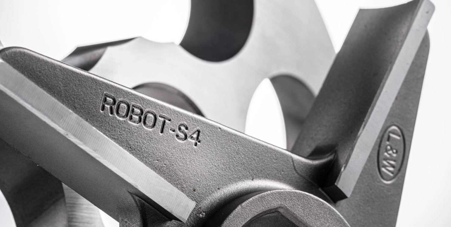
Brand strategy and visual identity for PRIMEdge, a global leader in knife sharpening for the food industry. We were commissioned to evolve the brand in order to strengthen and reaffirm its leadership in the sector. The result is a solid identity grounded in the values of Cozzini Primedge, giving PRIMEdge a renewed foundation that blends strength and technical precision with a sense of elegance.

Challenge
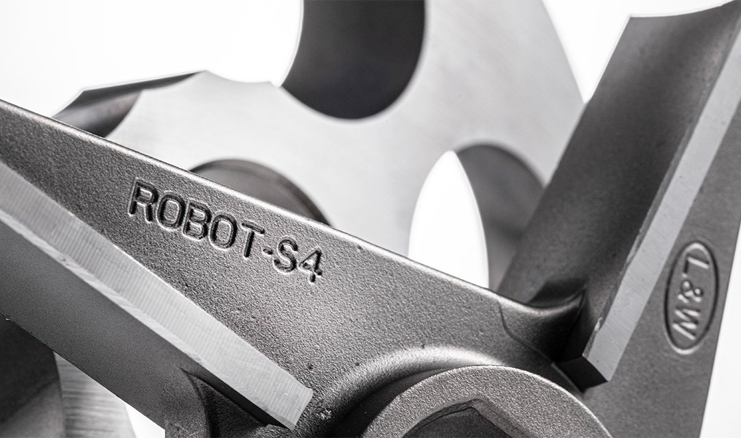
PRIMEdge, a global leader in precision knife sharpening, is headquartered in the U.S. with manufacturing facilities across North and South America and Europe. Rebranding a company with this level of reach and legacy is no small task. For years, the brand operated as Cozzini Primedge, in tribute to the founding family. The goal: to position PRIMEdge as the primary brand while preserving the emotional and historical value of the Cozzini name.

Solution
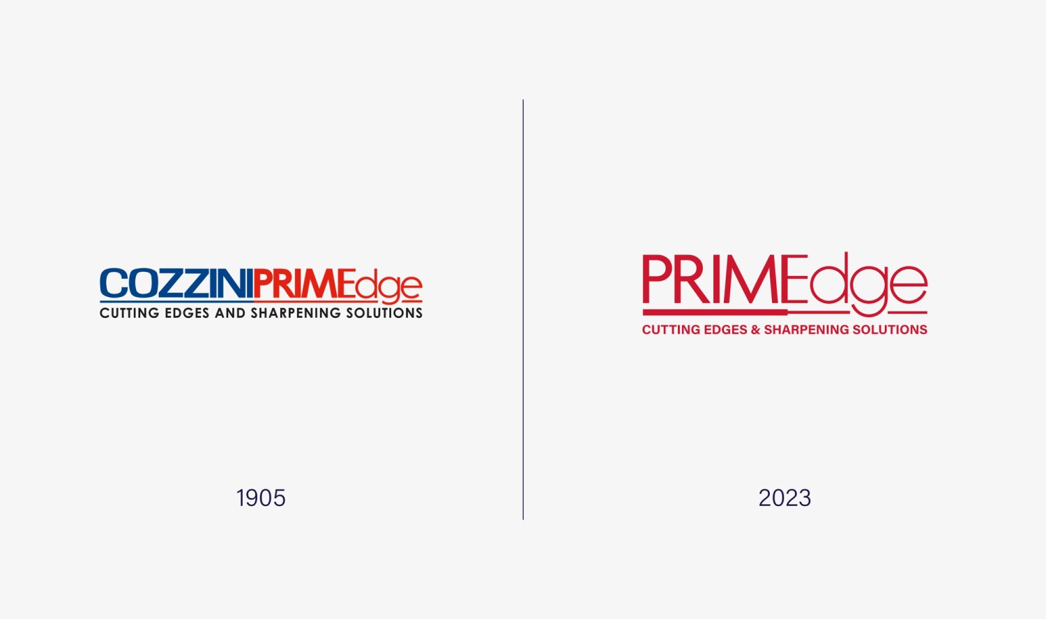
We redefined the brand strategy to support this transition, shifting from a name rooted in internal meaning to one built for global impact. PRIMEdge takes center stage, strengthened by a new hallmark: Cozzini Blade Legacy — a tribute to the company’s origins.
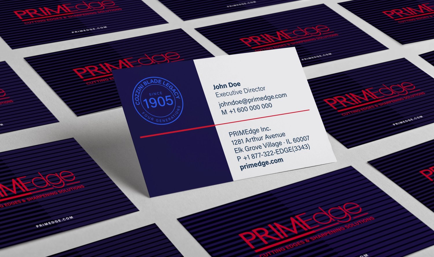
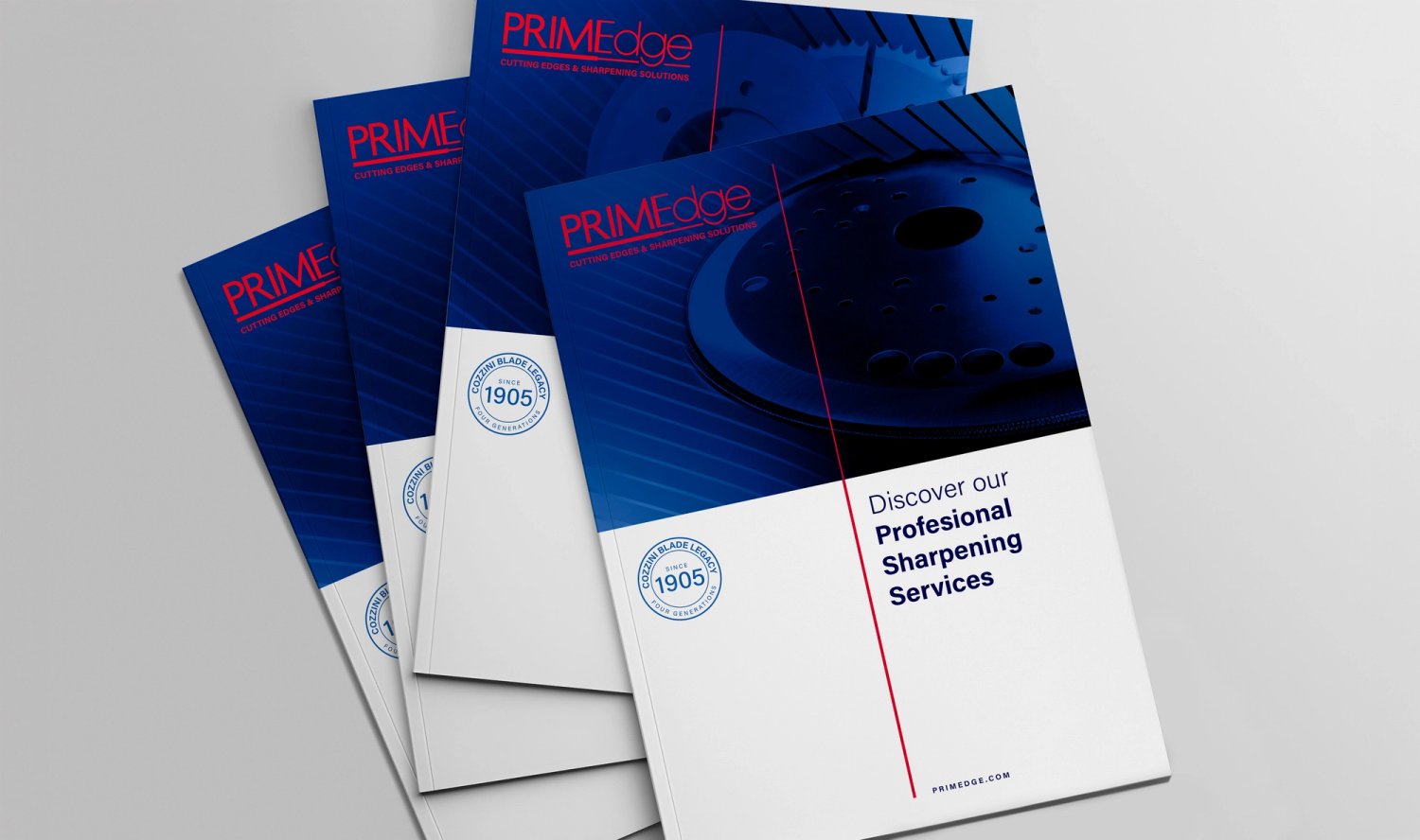
The new visual identity is bold and cohesive, designed to convey trust and precision. Strong, purposeful typography, a grid system inspired by industrial accuracy, and a technical color palette create a unified and confident brand expression.
The Cozzini Blade Legacy mark serves as a seal of trust, reinforcing continuity and the brand’s long-standing commitment to quality. It ensures that loyal customers continue to recognize the excellence they’ve always known — now under a clearer, sharper identity.

Related Projects