Sant Dalmai Logotip
Sant Dalmai
Sant Dalmai is a brand of Sant Dalmai Food Company. A company that was born in 1964 as a project of two friends linked to the world of charcuterie. From Safareig we have been in charge of redesigning the logo. To create a more recognizable, flexible, and updated brand, giving value to the history and prestige of the company.
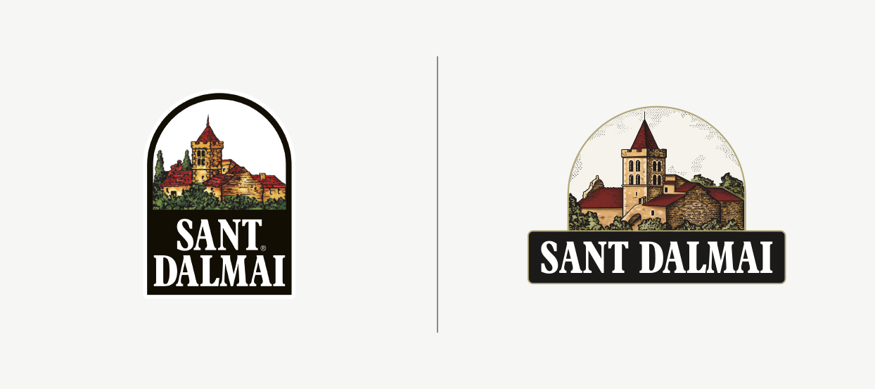
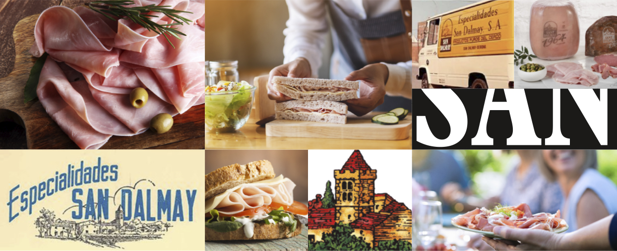
Through the logo design, we wanted to give a new vision to the brand, while recognizing its traditional and quality character.
We were very clear that it was essential to keep the arc shape of the original logo, since it is its most distinctive and recognized element in the market.
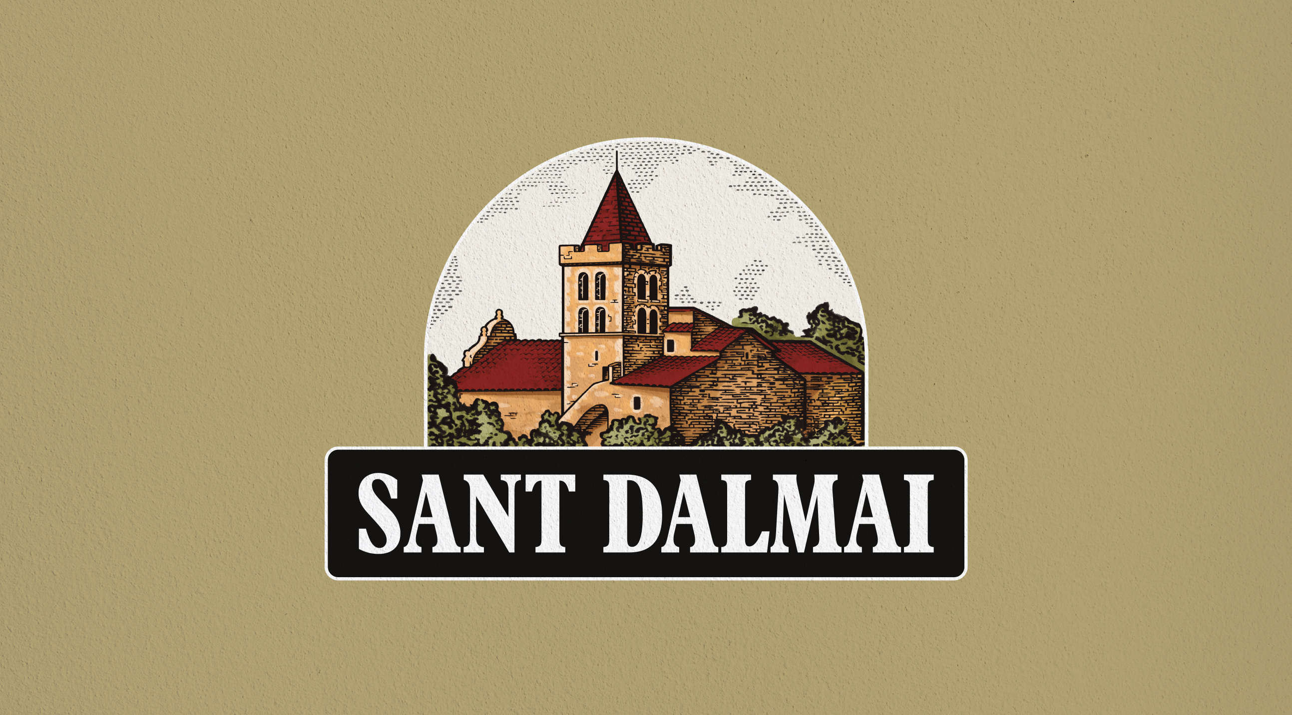
A very characteristic attribute of this logo is the duality between typography and illustration. In this new version we have readjusted the proportions of these elements to gain visibility, both in the illustration, which now has more prominence, and in the name "Sant Dalmai", which placed in a line has more legibility.
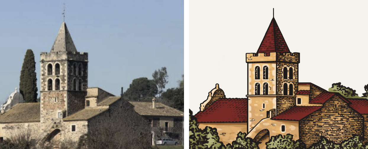
We have also chosen to keep the white-on-black typography and illustration as a graphic resource.
The illustration is intended to reinforce the traditional and antique character of the brand. The style of the illustration is similar to the original but with a more defined stroke and a more realistic view of the perspectives and elements.
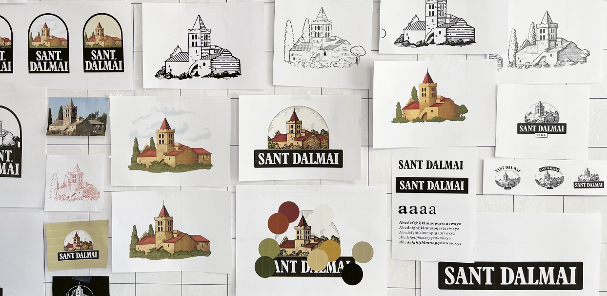
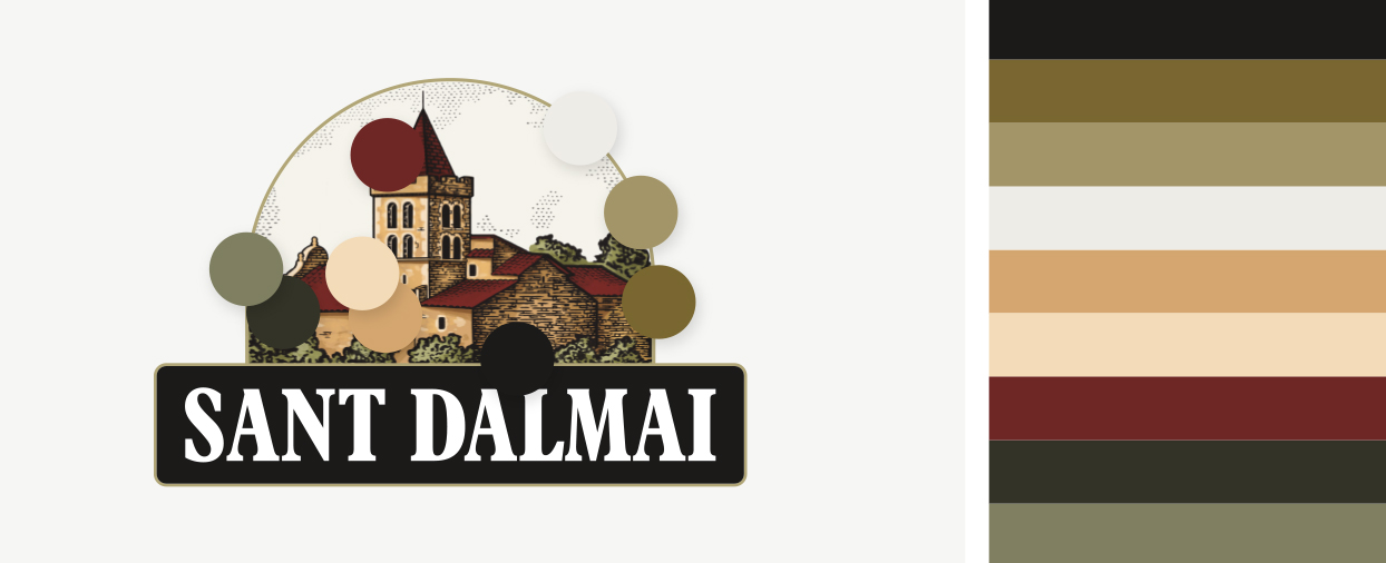
The color palette has been updated based on the colors of the original logo. The new range inspires earthy, more realistic and warmer colors, which give the brand a more natural and traditional feel to the product.
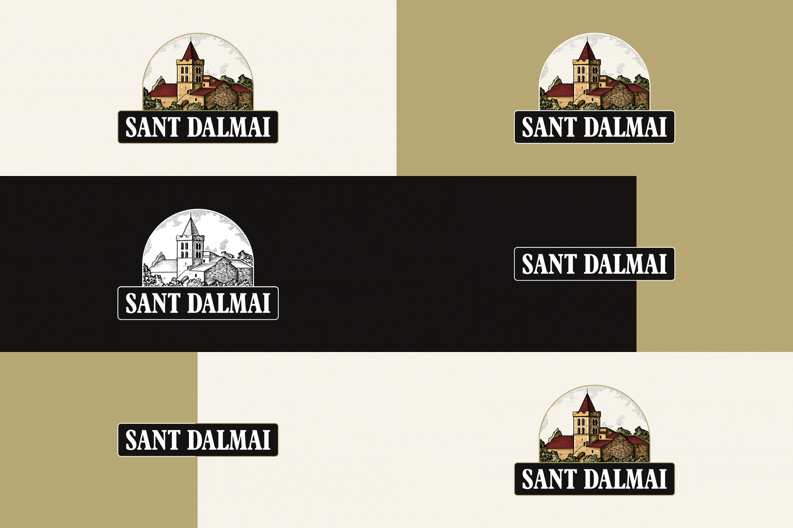
To update the logo, it was necessary to provide flexibility, so that the brand can be adapted to all new formats and prints. The designed logo has more than one format depending on where it is to be communicated, in addition to the presented version there is also a typographic-only option.


.jpg)
.jpg)
